
There are a lot of folks out there right now on financial cable channels, on the internet news outlets, social media, and even print media talking about the markets, the economy, and where things are headed. Most of them are making exciting predictions of some sort and often they’ll produce charts and graphs that are intended to support their prediction and lend authority to their position. Some of them are quite compelling, and no doubt at least a few of them will end up being correct when we can look back with the advantage of hindsight.
In the meantime, I want to share what I feel are the two most important stock market charts to keep in mind, now when the market is struggling as well as when the market is on a stronger footing. Neither of them is useful for making any sort of predictions, but I believe they do put market volatility in perspective and remind us that investing is all about the long–term.
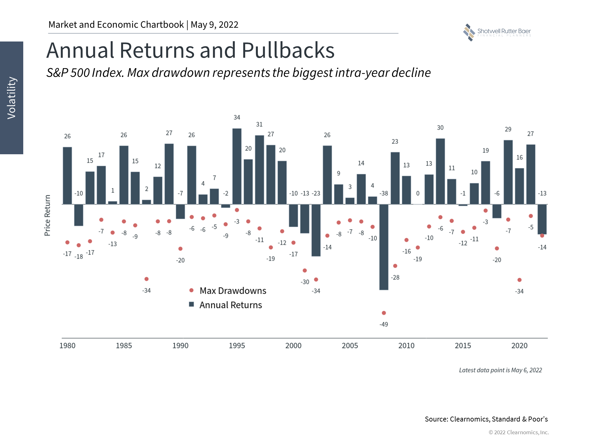
The first chart shows the annual return of the S&P 500 index (the 500 largest American companies) for the last 42 years, along with the worst pullback during the year. This chart is very important to keep in mind during volatile times as it shows that, almost every year, there is a period when being in the market felt horrible. In fact, the average intra-year pullback during that timeframe was – 13.5% Yet the average annual return during that period was a positive 9%. That’s right: at some point during the year, you should expect to see your stock holdings drop by double digits yet received a nice average return over that time. Stomaching that volatility is the price you pay to earn that return.

About Shotwell Rutter Baer
Shotwell Rutter Baer is proud to be an independent, fee-only registered investment advisory firm. This means that we are only compensated by our clients for our knowledge and guidance — not from commissions by selling financial products. Our only motivation is to help you achieve financial freedom and peace of mind. By structuring our business this way we believe that many of the conflicts of interest that plague the financial services industry are eliminated. We work for our clients, period.
Click here to learn about the Strategic Reliable Blueprint, our financial plan process for your future.
Call us at 517-321-4832 for financial and retirement investing advice.
Podcast: Play in new window | Download